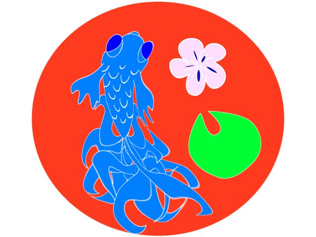
This is my second Illustrator attempt. Still not sure why this image turned out in negative colors. The fish is supposed to be orange and the red portiuon is actually blue. Let me know if you know why this is happening.

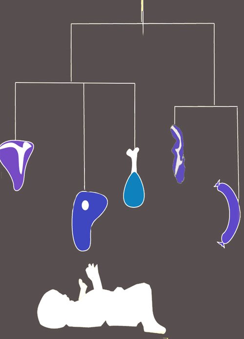 This is the first image I made with Adobe Illustrator. It is the design for a restaurant that Drew and Corey will be opening called the Meat Cradle. The premise of this restaurant is that all dishes are comprised entirely of meats and topped with meat gravy. No dish has fewer than two meats, for a example a bacon wrapped sausage or a ham covered steak would be normal items. This is my proposition for their logo, a baby in a cradle reaching up towards a mobile of meats. I want to change the mobile and add a cradle and I'm not sure why it came out in these colors since the true colors are reds. Let me know what you think Drew and Corey.

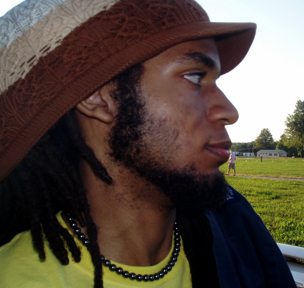
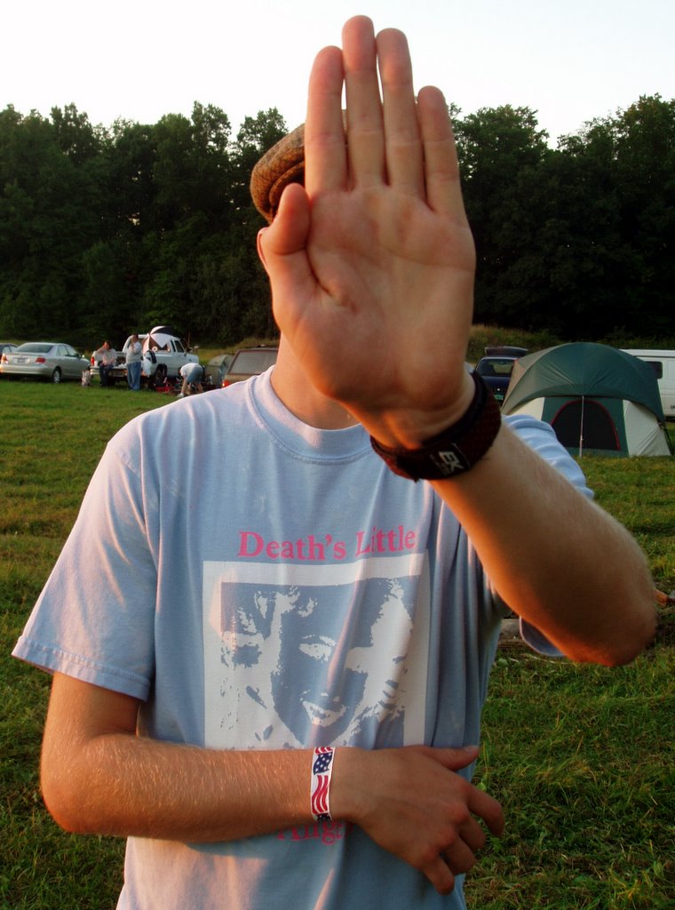
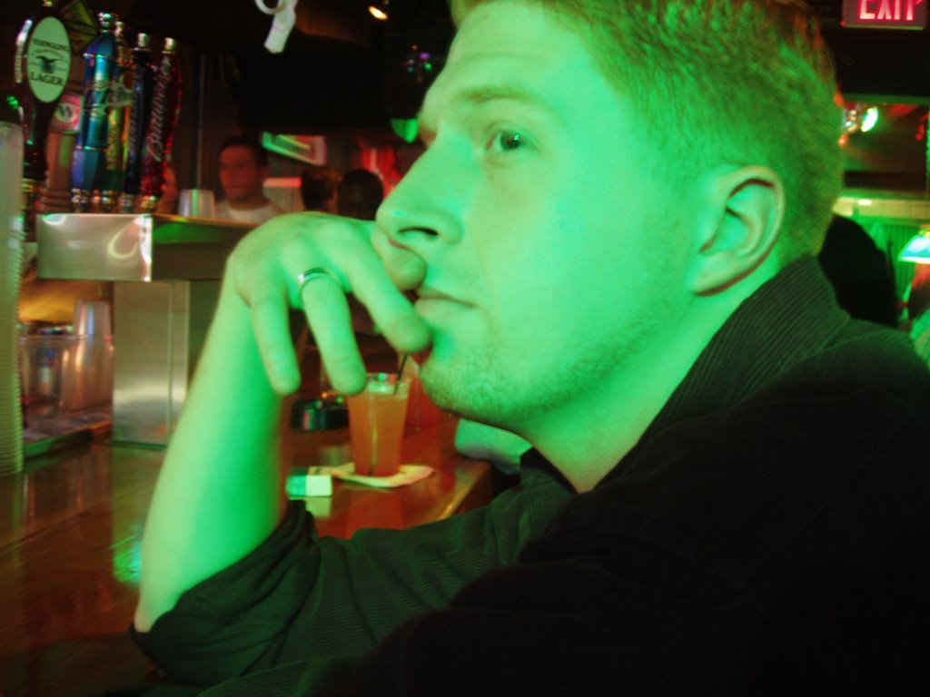
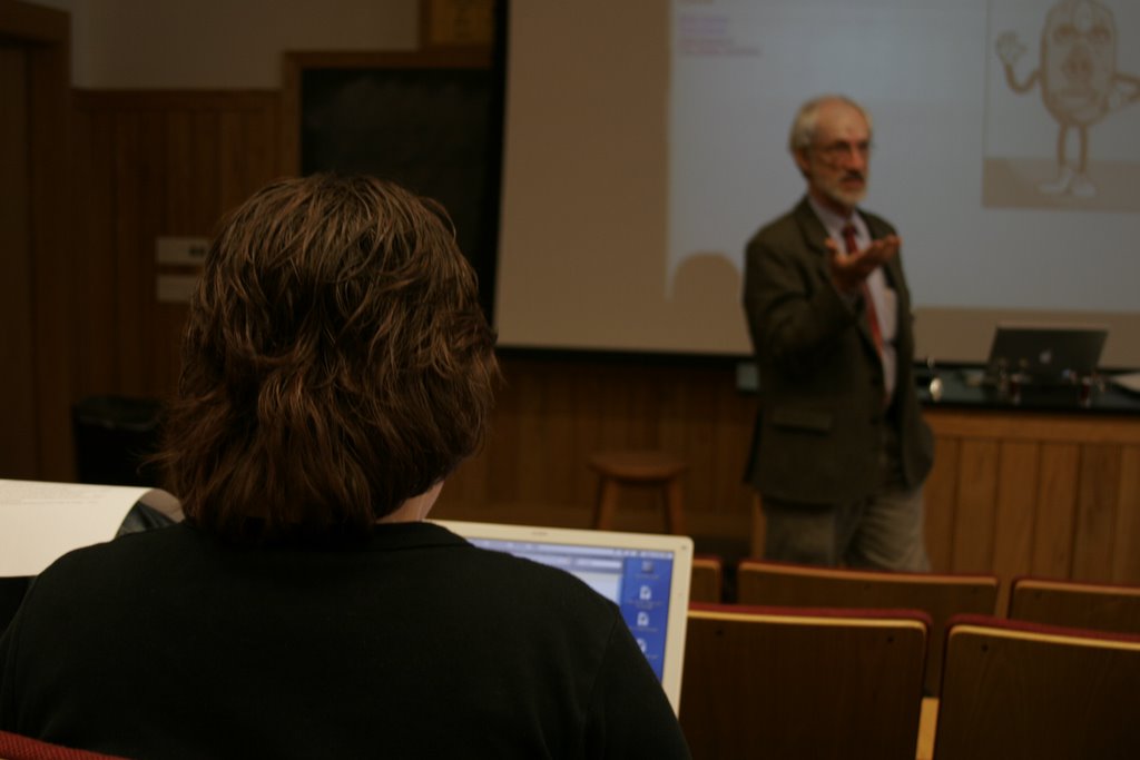
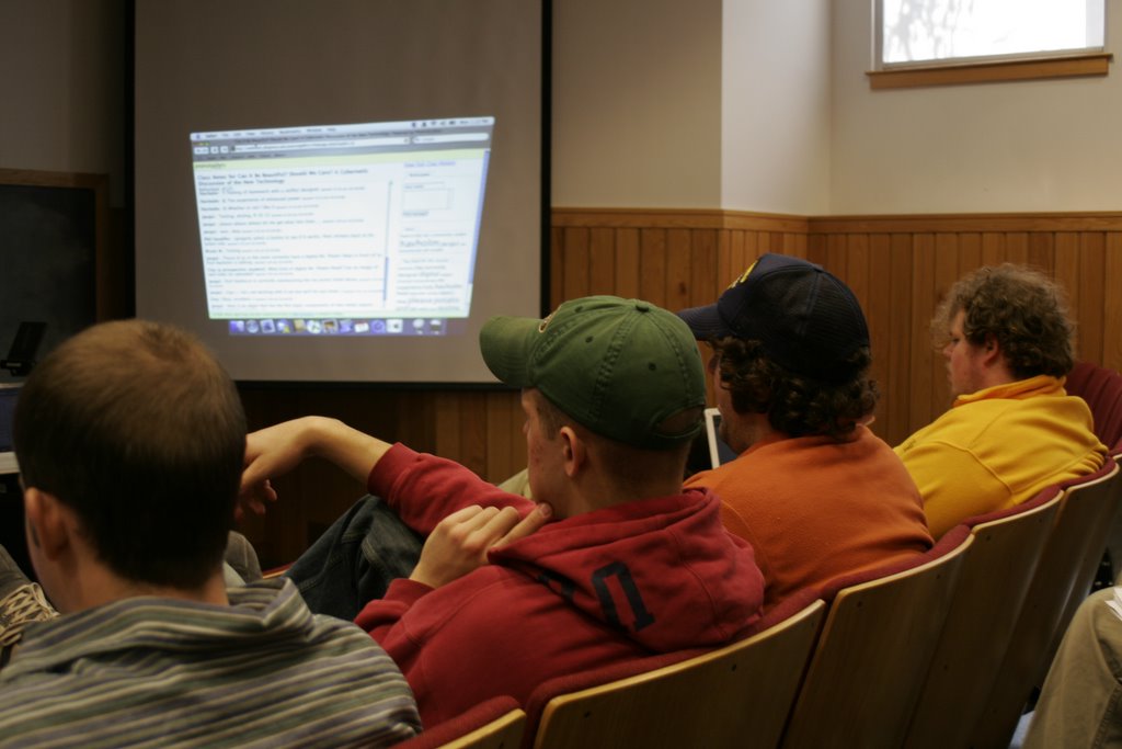
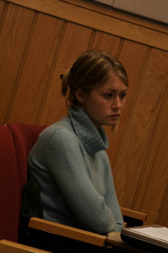
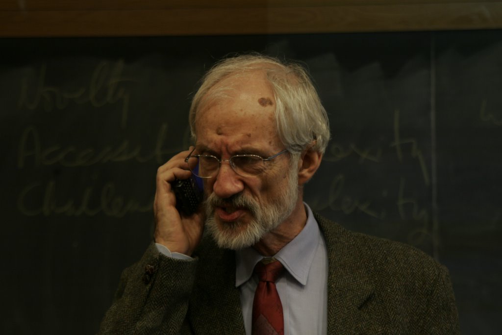 For my Digital Aesthetics class, taught by Professor Havholm (above), we conducted an experiment in which we opened the lecture up to the world by allowing people to listen in and contribute to the discussion via cell phone, AIM, and a note taking software called Peanutgallery. In addition we videotaped the class and I took digital stills. Here are some of my favorites.



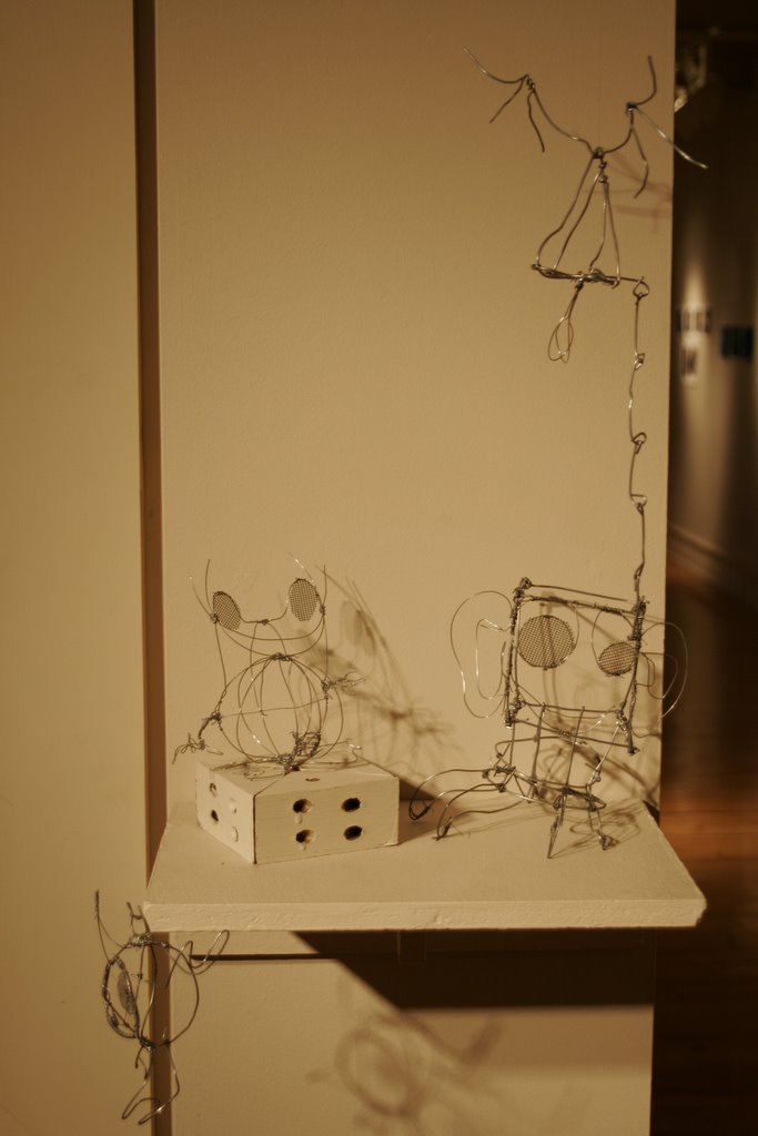
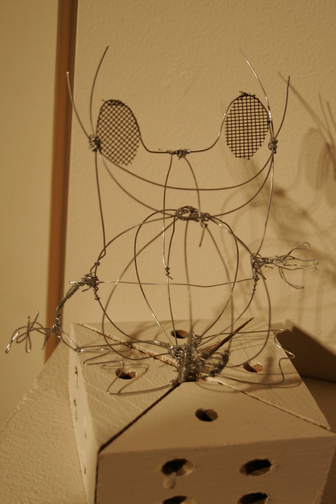

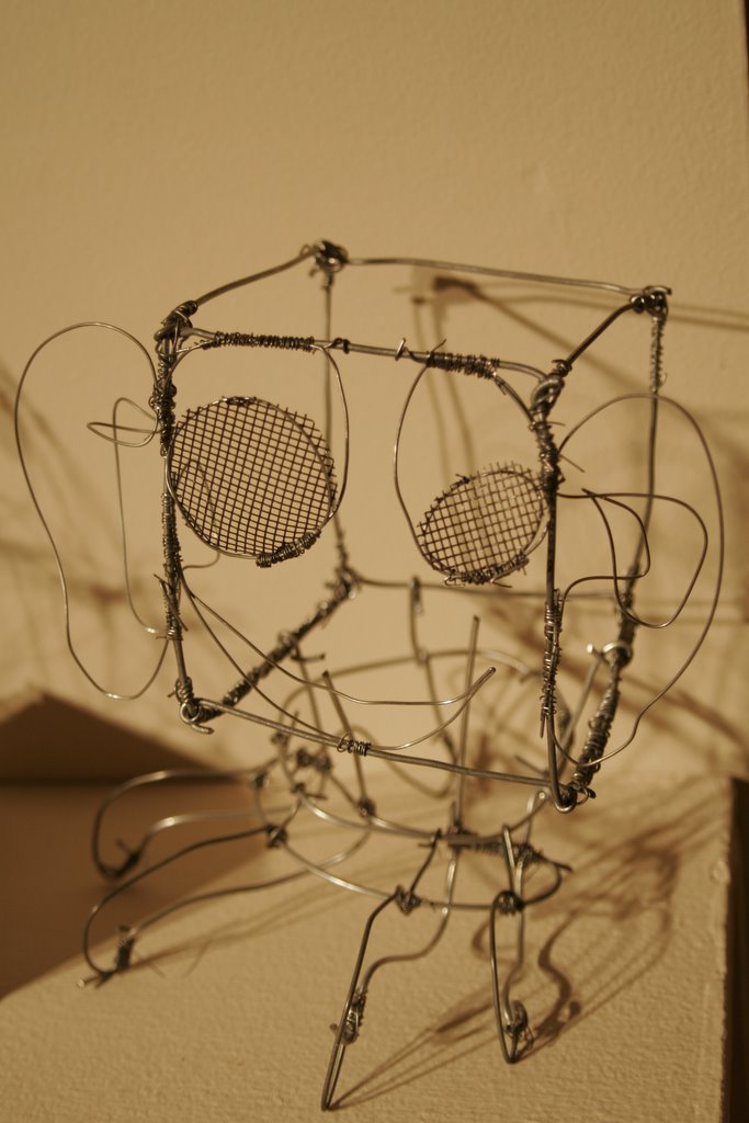
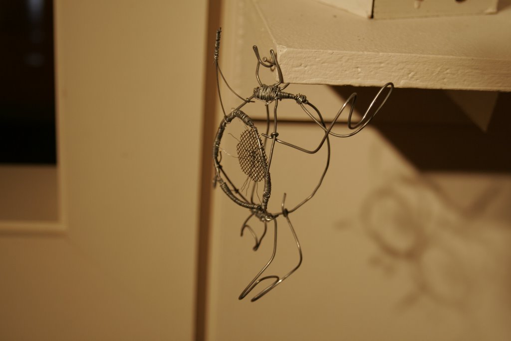 I have been really consumed by all my work, mostly my Senior IS movie shoot, so my post have been few and far between. I have been doing work, though, actually quite a bit. This is the second sculpture from my sculpture class. The requirement this time was to create an object with moving parts using wire. I decided to make multiple objects. These are monsters that are inspired by the work of Japanese artist Takashi Murakami. I think of them more as a beginning than a finished piece. Ideally this would be an army of monsters and I would make a playground for them to play on as well. So much I want to do and so little time.